I am the main product designer at Blloc Gmbh where I work on Ratio, a homescreen app that aims to help people use their phones meaningfully, reduce screentime, and eliminate distractions.
I oversaw our transition to Figma, am responsible for ongoing deployment of new features, as well as the development and scaling of our design system, which I continue to contribute to.
I led an overhaul of how we display and design widgets within our app, and also worked with the whole team to release a successful new onboarding experience. I produce animation and motion assets used within the app as well as for our social and ad channels.

Our research was showing us that although our current onboarding was great at having users land on a great looking homescreen, we weren’t doing enough to teach them about all the features we had available.
I had already been part of one previous redesign of this flow over a year prior. Although it was a big step up from before, we didn’t have a robust analytics backend built back then, and we had since learned so much more about mistakes we had made that first time around. Now, we had visibility on how it was currently performing, and we would be able to properly validate any changes we made to it. The new design would have renewed focus and be metric-driven from the onset.
We sat down and started collecting all of our research and insights on a FigJam board. This included survey results, competitor onboarding comparisons, and deep dives into standout flows from other apps so we could glean what would work best for us. We found FigJam to be a great collaboration tool for this early stage in the process and it really proved its worth here as we collected screenshots and put out thoughts down on virtual Post-its.

Ongoing user interviews and usability testing through platforms such as Playbook UX were showing us that users didn’t really know what to do after they finished the onboarding—it was like they were dropped off into the deep end—so we knew we would have to develop a new post-onboarding experience as well, to help acclimate our users to their new homescreen environment.
This was also a chance for us to really think about what Ratio really was and distill the value we offer into something users could immediately grasp. Our users needed to know what our app was about without any room for confusion.
We decided the new design had to prioritize:
Moving the needle for metrics that matter (trial starts, overall conversion, onboarding completion) .
Convey the core value proposition of the app as clearly and as quickly as possible.
Has some sort of hook to pique curiosity or increase attachment through micro-investments.
Simplify the overall structure to future-proof and reduce development complexity.
Provide a post-onboarding experience that can introduce users to features in-context
After splitting off to come up with separate flows, the team reconvened to discuss which way was the best way forward. We made a distinction between our “active’ wellbeing features, like being able to see and control usage time on individual apps, and our “passive” features, such as grayscaling the UI through monochrome wallpapers and icons.
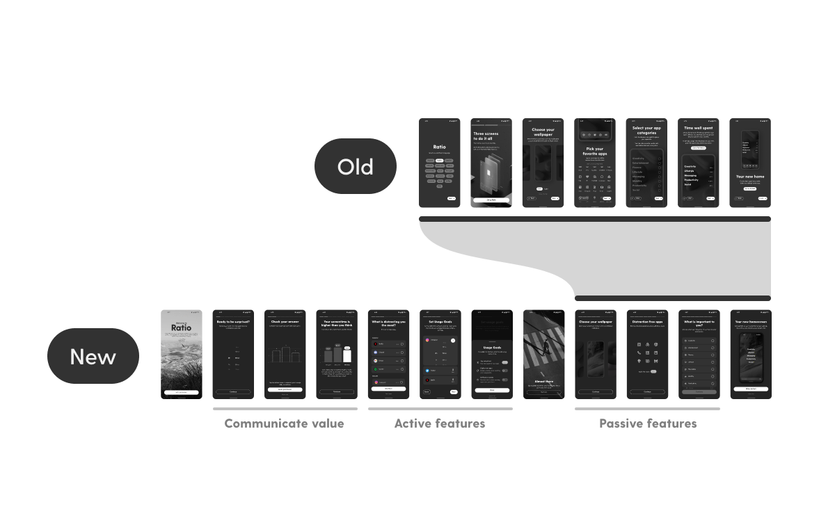
It eventually converged into a flow that built on top of the existing onboarding experience, which largely focused on setting up the passive features, but this time, we would show off our new active features right away. There was no progress indicator in the previous flow, so a set of story-like bars were added to the top of the screen to clue people in to how much they had left to go. We also changed the way we presented every step and made sure to explain how they all contributed towards an overall mission of helping reduce screentime.
The Hook
One important addition we had been talking about implementing within the team was some kind of personal touch in order for our users to feel attached to the outcome of the onboarding process. We had seen this used successfully in apps like Calm, Noom, and Brilliant, so we investigated a few methods, such as offering a series of multiple choice questions in an attempt to tailor the rest of the set up process. However, in the end we decided we couldn’t offer the same value through customization as well as these other apps.
What we eventually settled on was a short quiz game where users could guess how much time they spent on their phones, and we would surprise them with what their average time actually was, and most importantly, how much time they would save using Ratio. This was a chance to directly ask users for their App Usage permission, in a way that directly tied to something of value we could offer right away. We knew we needed to make the benefit of granting this permission as clear as possible to avoid users skipping this crucial step. The quiz turned out to be a huge hit and in subsequent tests we got exactly the holy $#@! moment from our users that we were hoping for.
Experiments
To further push metrics, we ran 2 experiments to see how they performed through AB testing. The first was inspired by Ep41 of the SubClub podcast, which would involve a soft paywall with an introductory video placed right after the initial welcome screen. The second was something we noticed in how Noom would attempt to aggressively winback potential customers by offering immediate discounts or offers. Rather than adjust our pricing, we decided to increase the odds someone would set Ratio to be their default home screen instead.
This was something we knew was strongly correlated with successful conversions, and by introducing a single bottom sheet if users skipped the final step, we increased default home screen adoption from 52.7% to 71.0%. The soft intro paywall fared worst though, and although trial starts were up from 5.1% to 6.0%, it actually negatively impacted overall conversion, so we decided to rollback that change.
Details
We introduced carefully tuned haptics throughout the whole flow to provide subtle feedback through all the interactions. There are stronger vibrations on primary buttons, and softer clicks when scrolling through lists.
Post-onboarding
We needed to strike a delicate balance being helpful or just too annoying (lest we create Clippy 2.0). The goal would be to introduce key features on each of our 3 main screens. We deemed floating tooltips too intrusive for an app that was meant to be in the background, so we instead used a floating prompt that would sit at the top of the home screen, waiting to be interacted with at your own pace, and easily swiped away to be dismissed. Expanding the tutorial prompt would reveal different flows, and tapping on them in any order would start the respective tour.
A big drawback we identified from the previous onboarding was a lack of education about how to continue to interact with the app. Despite the slick animated transitions between each step, the set up process was completely custom and not at all like what users would actually have to do. In the end, it just left our users with a beautiful home screen and no hint as to what they could do next. With the new post-onboarding flow, users could go through feature in-context, thus enabling them to remember how to do each task more clearly.
Conclusion
In the end, my team and I successfully implemented the new onboarding flow that led to a 25% increase in conversion for new user subscriptions, as well as a 30% increase in users choosing our app to be their default home app.
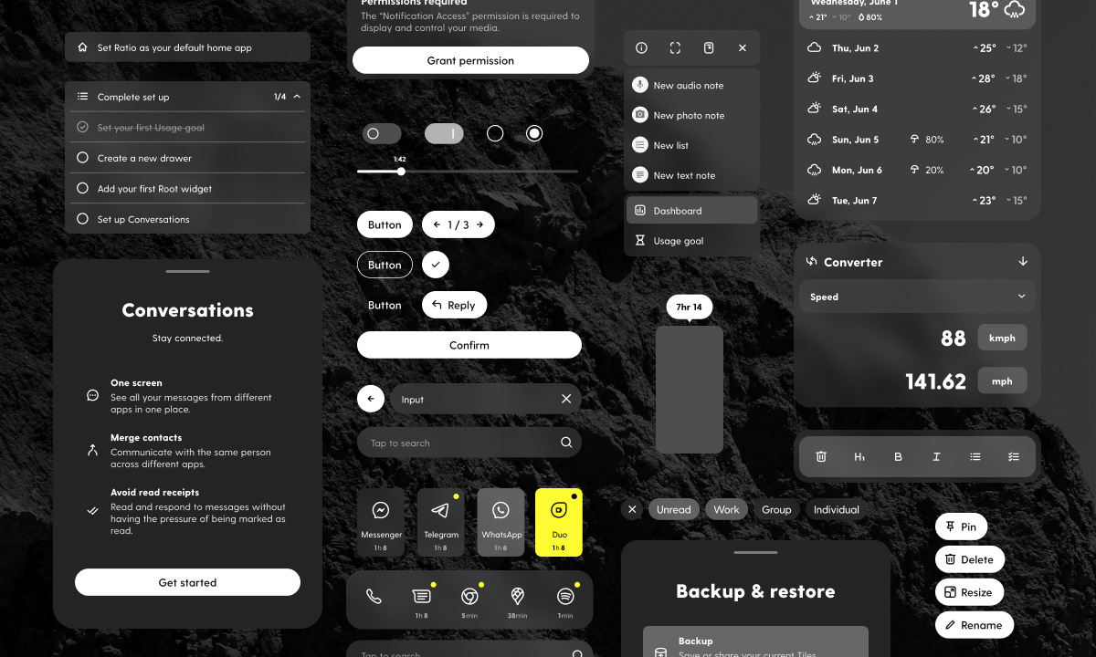
The impetus for this project had been building up for some time. Ever since launching Ratio publicly, we had always been receiving requests to open up the “Root”, a section of the app where we provided custom-built widgets. The underlying architecture of this screen was originally built in React, and it was the last holdover of a much older codebase. So, at the start of last summer, we embarked on a project that would involve finally getting rid of the legacy code and rebuilding the entire Root from the ground up in Jetpack Compose, as well as an entirely new set of custom widgets redesigned with a fresh eye.

The first step in this process was to create a comprehensive design system that would serve as the foundation of the new redesign. This involved developing a set of rules and layout that could be used to create a consistent and unified look and feel across both our own custom widgets and 3rd-party ones. I started out with a few sketches because I find I am less constrained when thinking on paper, before moving into Figma to refine the early mocks with the rest of the team.

Next, I defined the shared architecture of the base wrappers that would serve as the underlying scaffolding for all the widgets. This would include a top header that would remain even when the cards collapsed, and help unify the disparate 3rd-party widgets under some kind of shared “Ratio” aesthetic. Our own custom widgets would be constructed out of nesting panels with their own padding and radius values, with their visibility and colour would be determined based on contrast and balance as needed.
I wanted the new Root to feel like an extension of the main home screen, which meant it had to adopt familiar interaction patterns. The base wrappers share the same colour and styling as the “Tiles” that contain your apps, and new long press & drag actions were added to the widgets to make the two screens feel more seamless. Although their underlying architecture was now different, users wouldn’t be able to tell them apart from one another.
Each custom widget was like designing a mini-app all on its own, so we progressed through this sprint in stages, with developers tackling widgets as design on them completed. What set our own widgets apart would be that rather than collapsing down to just the header, they would have unique collapsed states that would contain glanceable information, as well as expanded states that could support more complex interactions.
Because we were rebuilding this entire screen from scratch, I knew this was my chance to push for certain key elements to be incorporated. I stressed the importance of animation and fluidity in order to elevate how navigating it would feel, and also advocated for the adoption of a shared set of animated interactions and transitions. I had these prepared early on in the concept phase of our project so they would be ready for developers to reference, and worked closely with them to explore the new Easing functions in Compose so what we had in our designs would be translated one-to-one into the codebase.
Unlike other widgets, we could freely change the shape of ours, meaning in the News widget an article preview could expand upwards rather than opening another app, or in our Notes widget, users could view, open, and edit their notes all without ever leaving their home screen. This was a big selling point for the Root and our custom tailored experience, because staying on the home screen meant less time wasted in other apps.
At Blloc I built and developed a design system that allows us to build high fidelity flows in just a few minutes. I’m a firm believer in using auto-layout and making the most of Figma’s latest features such as interactive components and nested instances.
These proved invaluable in reducing the amount of frames needed for complex animation as well as greatly reducing the variant count for some of our more complex components. Just like lego blocks, it became easy enough to use that members of the team that weren’t designers, like my product manager, could build out simple flows easily.
When I was first brought on the team, the existing icon library wasn’t created on any kind of baseline grid. Over time, I brought all the disparate icons into alignment with consistent stroke widths, shared shapes, and radii, creating a unified visual style. Icons in Ratio display at a size that is a little more compact than usual (20dp vs 24dp), so every icon was custom crafted to be as information dense as possible while preserving readability.

Last summer, together with the developers, I pushed for adopting semantic design system tokens, so we can refer to our base colour styles in a way that’s future-proof and easily changed for future iterations.
Our app supports 4 themes, a dark & light theme that incorporates translucency, and another dark & light pair that’s opaque. Using tokens greatly accelerated things not only on the development side, but in Figma, creating the 4 separate versions of every flow became as simple as switching out tokens to each of its corresponding themes (Dark/Primary → Light/Primary, Dark/Highlight → Light/Highlight, etc).
Beyond just the design system, I also actively work with my product manager and developers to streamline the handoff process. This is an ongoing project, as we’re learning new efficiencies every time we push out a new feature. I provide thorough documentation before a kickoff meeting that includes key flows & screens, redlines, and specific animations. If the need arises, I’m also familiar with HTML, CSS, JS, and Java, so I can work directly with a developer looking at the codebase to spot any issues.
